Classic Storybook vs Modern Digital Art — The Style Choice That Shapes Your Characters
Choosing an illustration style shapes how readers experience your characters. Here's how classic storybook and modern digital art compare — and when to use each.
Two traditions, one goal
Every illustrated book faces the same question: how should the characters look? The answer usually falls somewhere between two broad traditions — the warm, hand-rendered aesthetic of classic storybook illustration, and the clean precision of modern digital art. Neither is better. They solve different problems and create different emotional responses in readers.
What defines "classic storybook" style?
Classic storybook illustration draws from a long tradition of hand-painted children's books and fairy tale art. Think soft watercolors, visible brushstrokes, warm color palettes, and characters with slightly exaggerated proportions that feel approachable.
The hallmarks: gentle lighting, textured backgrounds that feel like paper or canvas, muted earth tones mixed with pops of color, and a sense of warmth that makes you want to linger on each page. Artists like Beatrix Potter, Maurice Sendak, and contemporary illustrators like Oliver Jeffers work in this tradition.
This style excels at evoking nostalgia, comfort, and emotional intimacy. Characters feel like they exist in a world you could touch.
What defines "modern digital" style?
Modern digital illustration uses the precision of digital tools to create clean lines, smooth gradients, vibrant colors, and detailed rendering. Characters tend to have more polished, consistent proportions — sometimes stylized, but always controlled.
The hallmarks: crisp edges, bold color choices, dynamic lighting and effects, and a level of detail and consistency that's difficult to achieve by hand. Think Pixar concept art, contemporary graphic novels, or the polished character designs you see in modern indie games.
This style excels at creating immersive, visually striking worlds. Characters feel cinematic and contemporary.
Character consistency: a practical difference
One practical consideration often overlooked: maintaining character consistency across many illustrations.
Classic storybook styles embrace subtle variation. A character's proportions might shift slightly from page to page, and that's part of the charm — it feels hand-crafted. But if you need your protagonist to look exactly the same across 30+ pages, this organic variation can become a challenge.
Modern digital styles make consistency more straightforward. Clean lines and defined proportions are easier to reproduce precisely. For projects like graphic novels, TTRPG sourcebooks, or series with recurring characters, this predictability matters.
Tools like PulseBook's character consistency engine help bridge this gap in both styles — you define a character once, and the system maintains their appearance regardless of which illustration style you choose.
Matching style to genre
Your genre and audience should drive the choice, not personal preference alone.
Classic storybook works well for:
- Picture books and early readers
- Poetry collections and literary fiction
- Memoir and personal narratives
- Recipe books and lifestyle guides
- Stories emphasizing emotion and atmosphere
Modern digital works well for:
- Fantasy and sci-fi novels
- TTRPG sourcebooks and campaign guides
- Comics and graphic novels
- Action-driven stories
- Projects targeting younger, digitally-native audiences
Of course, the most interesting work often breaks these conventions. A gritty fantasy novel in watercolor style can be striking. A children's book with bold digital art can feel fresh and contemporary.
Cost and timeline considerations
Traditionally, style choice affected cost dramatically. A hand-painted watercolor illustration took days; a digital piece could be faster to iterate on but required expensive software expertise.
With AI illustration tools, this gap has largely closed. Both styles can be generated quickly, and the choice becomes purely creative rather than budgetary. The real cost factor is now iteration — how many rounds of refinement you need to get the look right.
Classic styles can be more forgiving of imperfections (visible brushstrokes hide minor inconsistencies). Modern digital styles demand more precision, so you may spend more time fine-tuning.
You don't have to choose just one
Many successful books blend approaches. A fantasy novel might use a warm, painterly style for chapter illustrations and clean digital art for maps and diagrams. A cookbook could pair hand-drawn ingredient sketches with crisp, modern food photography styling.
The key is consistency within context. If you switch styles, do it deliberately — between chapters, between text types, or between narrative and reference sections. Don't mix randomly within a single scene.
Frequently Asked Questions
Which illustration style is better for self-published books?▾
Can AI tools produce authentic classic storybook illustrations?▾
How do I maintain character consistency across different illustration styles?▾
Is modern digital art more expensive than classic styles?▾
Explore These Styles
See these illustration styles in action — each with sample images and full details.
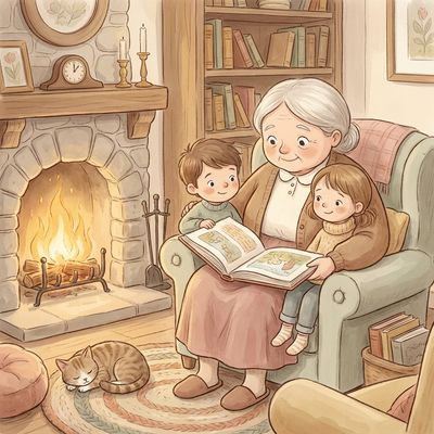
Cozy Storybook
Warm, inviting style inspired by classic picture books with soft, rounded shapes.
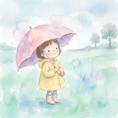
Whimsical Watercolor
Delicate watercolor style with soft edges and translucent color layers.
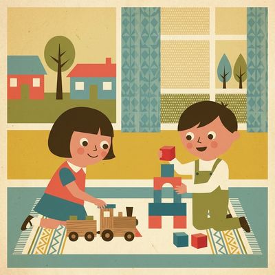
Vintage Nursery
Mid-century children's book style with clean shapes and retro aesthetics.

Soft Digital Painting
Contemporary digital painting with smooth gradients and soft lighting.
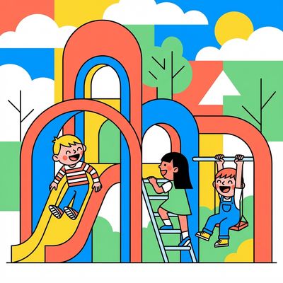
Bold Vector Pop
Clean, modern vector-style with bold shapes and confident lines.
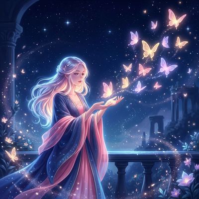
Glowing Dreams
Ethereal digital style with soft glow effects and dreamy atmosphere.
Try These Styles Yourself
Create characters, pick a style, and generate consistent illustrations for your book.
Start Free