Charcoal Drama vs Moody Noir
While both 'Charcoal Drama' and 'Moody Noir' leverage a predominantly grayscale palette for dramatic impact, they diverge significantly in their approach to detail, mood, and character focus. Charcoal Drama emphasizes raw emotional intensity and classical rendering, whereas Moody Noir crafts cinematic atmospheres and powerful silhouettes.
Key Differences
Color Palette & Warmth
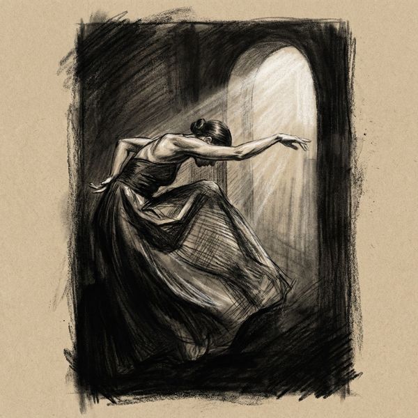
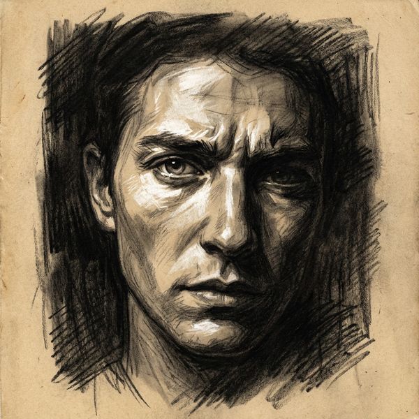
Employs a full spectrum from deep charcoal black through warm grays to bright white, with the inherent paper texture tan adding a natural, subtle warmth throughout the illustration.
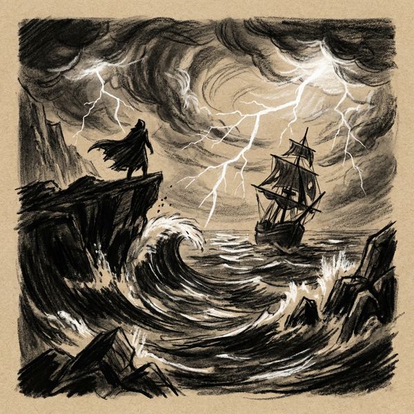
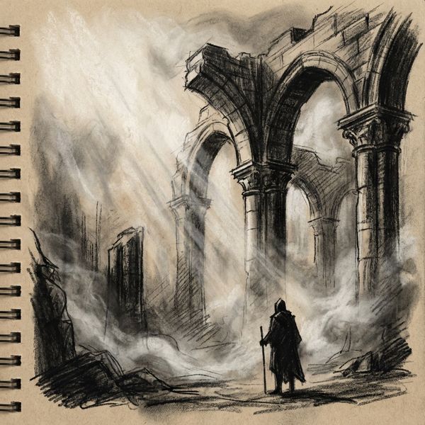
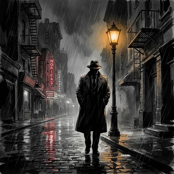
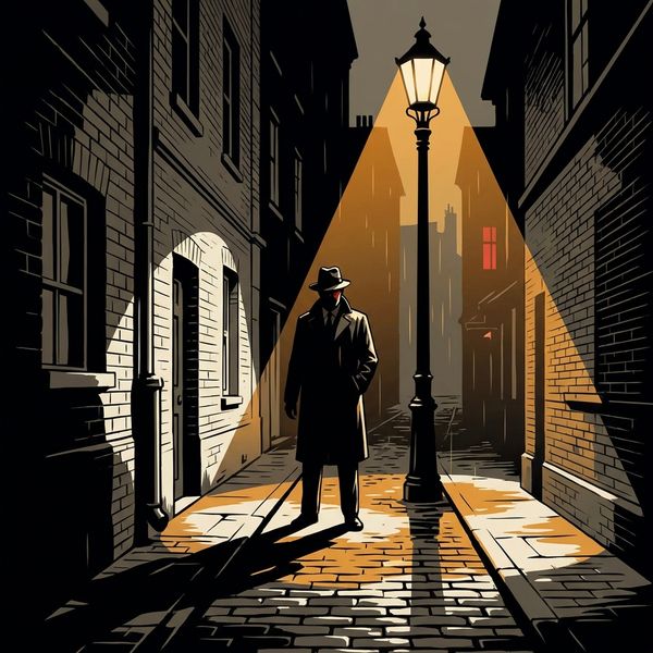
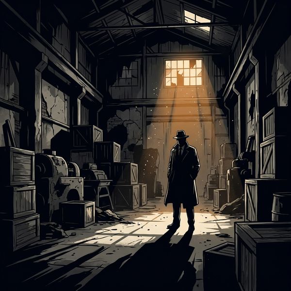
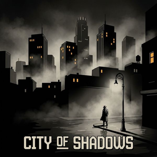
Predominantly grayscale, utilizing deep blacks, warm grays, and off-whites. Color is introduced sparingly and strategically with rare accents of deep red or amber to create focal points or heighten drama.
Character Rendition & Detail
Features dramatic figures with strong classical proportions and lighting. Faces are rendered with significant detail, emerging from shadow to convey complex emotions and expressions.
Characters have realistic proportions but are defined primarily by strong, impactful silhouettes. Expression is conveyed through dynamic pose and the interplay of light and shadow, rather than intricate facial detail.
Mood & Aesthetic Inspiration
Creates powerful, emotionally intense illustrations inspired by classical figure drawing and dramatic fine art. It evokes a timeless, profound, and often raw artistic feel.
Delivers a cinematic, atmospheric quality, drawing heavily from film noir and graphic novel aesthetics. It results in high-impact, dramatic images that suggest mystery, suspense, and a gritty urban edge.
Use of Light & Shadow
Utilizes bold mark-making and strong value contrasts to sculpt forms and reveal detail. Light is often used dramatically to highlight specific features and enhance emotional intensity, creating a sculptural effect.
Focuses on creating stark contrasts and dramatic areas of deep shadow to build atmosphere and define strong, graphic shapes. Light often serves to reveal only what's necessary, leaving much to the imagination.
When to Choose Charcoal Drama
Choose 'Charcoal Drama' for projects demanding deep emotional resonance, intricate character portrayal, and a powerful, classical artistic presence, perfect for literary or character-driven narratives.
Try Charcoal DramaWhen to Choose Moody Noir
Opt for 'Moody Noir' when your story requires a strong sense of atmosphere, suspense, or grit, ideal for thrillers, detective stories, or graphic novel concepts where cinematic mood and strong visual impact are key.
Try Moody NoirMore Resources
Frequently Asked Questions
Which style is better suited for showcasing intricate facial expressions?▾
Can I incorporate color into these predominantly grayscale styles?▾
Which style creates a more 'gritty' or 'urban' feel?▾
Try Both Styles Free
The best way to choose is to see both styles with your own characters and story. Create a free account and try them side by side.
Start Free