Paper Cut Folk Art vs Scandinavian Watercolor
PulseBook.io empowers creators with a diverse array of illustration styles. This comparison delves into two charming aesthetics – Paper Cut Folk Art and Scandinavian Watercolor – each offering a unique visual narrative, perfect for projects seeking either a tangible, whimsical touch or a gentle, comforting ambiance.
Key Differences
Visual Depth & Texture
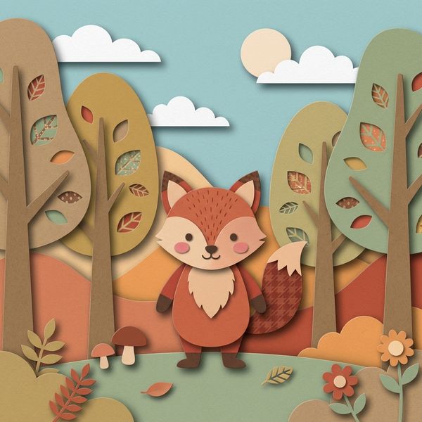
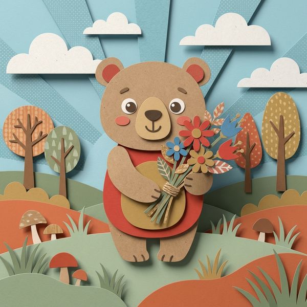
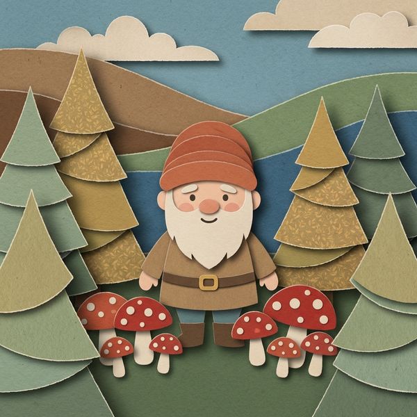
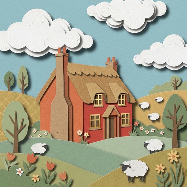
This style excels in creating stunning 3D layered compositions. Every element appears physically cut and assembled from textured craft paper, with visible edges casting soft shadows, providing real dimensional depth and a tactile, handcrafted feel.
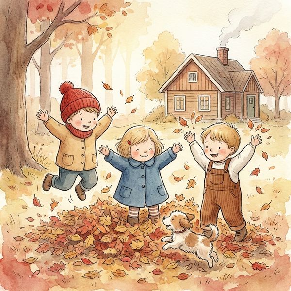
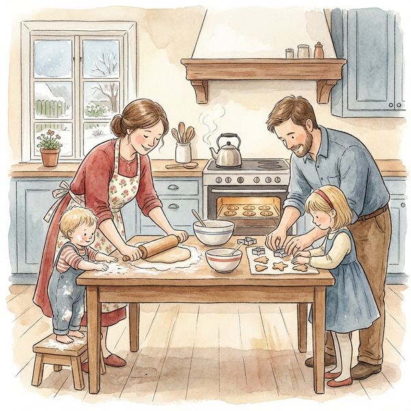
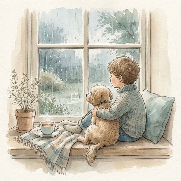
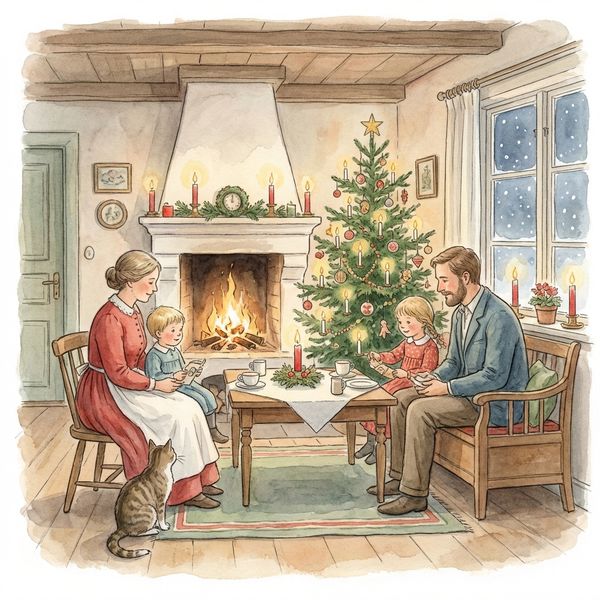
Emphasizes a soft, blended aesthetic with delicate linework, reminiscent of traditional watercolor paintings. It delivers a flatter, ethereal appearance, focusing on smooth color transitions and translucent washes rather than physical depth.
Color Palette & Application
Features a warm, earthy palette of terracotta, kraft brown, sage green, and dusty gold, often contrasting vividly against cool sky blue backgrounds. Colors are applied in solid, textured blocks, mimicking actual paper with visible grain and subtle patterns.
Utilizes a harmonious warm earth-tone palette, rendered through soft, translucent washes that blend seamlessly. The color application creates an inviting, nostalgic atmosphere with a gentle, diffused quality, often highlighting natural light.
Character & Environment Style
Characters and environments are constructed from distinct, layered paper shapes, resulting in charmingly simplified forms with a graphic, artisanal quality. Details are defined by cut lines, overlapping elements, and implied textures.
Characters boast rounded, friendly proportions with warm features and gentle poses, evoking a classic children's book feel inspired by Nordic traditions. Environments are hygge-inspired, showcasing cozy interiors, seasonal elements, and soft, ambient light.
Overall Mood & Best Fit
Perfect for projects requiring a whimsical, authentic, and tactile feel. It brings a playful, handcrafted charm that feels both rustic and sophisticated, ideal for engaging readers with its unique physicality and storybook depth.
Best suited for stories that aim for a cozy, nostalgic, and comforting atmosphere. It evokes the gentle warmth of Nordic traditions, perfect for lullabies, heartwarming tales, or serene educational content that fosters a sense of peace.
When to Choose Paper Cut Folk Art
Choose Paper Cut Folk Art for projects that need a distinctive, tactile presence, such as interactive children's books, craft-themed narratives, or educational content that benefits from a sense of playful construction and tangible depth.
Try Paper Cut Folk ArtWhen to Choose Scandinavian Watercolor
Opt for Scandinavian Watercolor when your story calls for a gentle, heartwarming aesthetic, ideal for bedtime stories, sentimental narratives, or designs that aim to evoke peace, comfort, and a touch of Nordic charm and coziness.
Try Scandinavian WatercolorMore Resources
Frequently Asked Questions
Which style offers more visible texture?▾
Can either style convey a sense of 'cozy' or 'hygge'?▾
Which style is better for portraying dynamic scenes or action?▾
Try Both Styles Free
The best way to choose is to see both styles with your own characters and story. Create a free account and try them side by side.
Start Free