How to Choose an Illustration Style for Your Book
Watercolor, ligne claire, manga, gothic — with 25+ AI illustration styles, how do you pick the right one? A practical guide to matching style to story.
Why style is your book's first impression
Before anyone reads your first sentence, they see your cover. Before they meet your characters, they see how they're drawn. Style is the handshake, the first impression, the visual promise of what kind of experience your book offers.
A watercolor cover promises warmth and nostalgia. A manga-style cover promises energy and adventure. A gothic fairytale style promises mystery and atmosphere. Each style sets expectations — and your story either fulfills them or breaks them.
Choosing the right style isn't about picking what looks "best" in isolation. It's about picking what best serves your story, your genre, and your reader's expectations.
Matching style to genre and audience
Different genres and audiences have different visual conventions. Here's a practical mapping:
Picture books (ages 3-7): Warm, approachable styles work best. Cozy Storybook, Whimsical Watercolor, and Vintage Nursery evoke the bedtime-story feel parents and children expect. Bright colors, soft edges, and expressive characters.
Early readers (ages 5-9): Slightly more dynamic but still warm. Bold Vector Pop, Soft Digital Painting, and Cartoon Classic strike a balance between the gentleness of picture books and the energy older kids crave.
Middle grade (ages 8-12): More variety opens up. Manga Action, Ligne Claire, and Anime Fusion work for adventure and fantasy. Charcoal Drama and Gothic Fairytale work for darker or more atmospheric stories.
YA and adult fiction with illustrations: Style becomes a deliberate artistic choice. Japanese Woodblock signals literary ambition. New Yorker Cartoon signals wit and sophistication. Neon Dreams signals genre fiction with edge.
Non-fiction and reference: Clean, precise styles. Ligne Claire and Bold Vector Pop work well for instructional illustrations. Felt and Fabric style works for craft and DIY books.
The emotional palette: how each style feels
Beyond genre fit, each style carries an emotional tone. Some examples:
- **Cozy Storybook** — warm, safe, nostalgic. Feels like being read to on a rainy afternoon. - **Gothic Fairytale** — mysterious, atmospheric, slightly dark. Feels like wandering through an old forest at dusk. - **Manga Action** — energetic, dramatic, urgent. Feels like anything could happen in the next panel. - **Whimsical Watercolor** — gentle, dreamy, emotional. Feels like a half-remembered childhood memory. - **Neon Dreams** — futuristic, edgy, cool. Feels like a synthwave album cover come to life. - **Japanese Woodblock** — timeless, dignified, serene. Feels like a museum piece reimagined for your story. - **New Yorker Cartoon** — witty, understated, sophisticated. Feels like an inside joke shared with the reader.
Testing styles quickly with AI
One of the biggest advantages of AI illustration is how fast you can test styles. In the traditional publishing world, "trying a different style" meant hiring a new illustrator and spending thousands of dollars.
With PulseBook, you can generate the same scene in 5 different styles in under 5 minutes. Create one character, write one scene description, then switch styles and regenerate. You'll know immediately which style feels right for your story.
Here's a practical workflow: 1. Pick the one scene that best represents your book's tone. 2. Generate it in 4-5 candidate styles. 3. Look at the results side by side. Which one makes you feel what you want readers to feel? 4. Go with your gut. There's no wrong answer — only what serves your story.
Common style/genre pairings that work
While there are no hard rules, some pairings consistently produce great results:
- **Fantasy quest + Ligne Claire:** Clean European comic style gives your adventure a classic, timeless feel. - **Bedtime story + Cozy Storybook:** Warm, hand-painted aesthetic that feels like a family heirloom. - **Sci-fi adventure + Neon Dreams:** Synthwave energy that signals futuristic action. - **Memoir/poetry + Whimsical Watercolor:** Gentle, emotional illustrations that leave room for the reader's imagination. - **TTRPG sourcebook + Soft Digital Painting:** Polished, detailed illustrations that feel like a professional game manual. - **Horror/dark fantasy + Gothic Fairytale:** Atmospheric, shadow-rich illustrations that build dread.
But the most memorable books often break conventions. A horror story in Cozy Storybook would be deeply unsettling. A romance in Neon Dreams would feel fresh and unexpected. If you have a vision, trust it.
Frequently Asked Questions
Can I change illustration styles mid-book?▾
What if I can't find a style I like?▾
How many styles should I compare before deciding?▾
Does the style affect generation speed or cost?▾
Explore These Styles
See these illustration styles in action — each with sample images and full details.
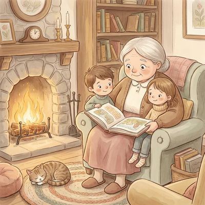
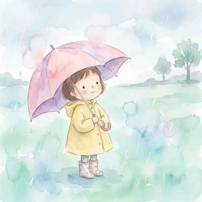
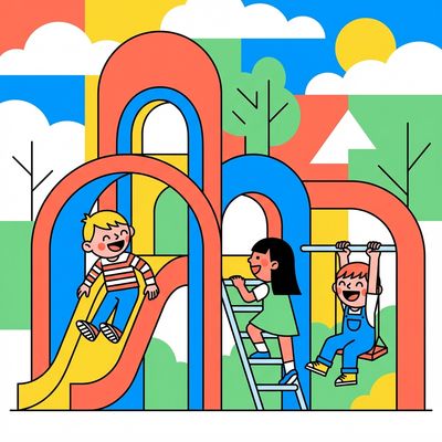
Cozy Storybook
Warm, inviting style inspired by classic picture books with soft, rounded shapes.
Ligne Claire
Clean uniform outlines with flat vivid colors, inspired by Hergé and European comics.
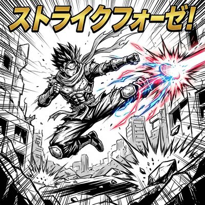
Manga Action
Dynamic manga-style with bold linework and high-energy compositions.
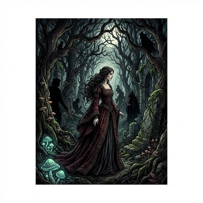
Gothic Fairytale
Dark, romantic style inspired by classic fairy tale illustrations.
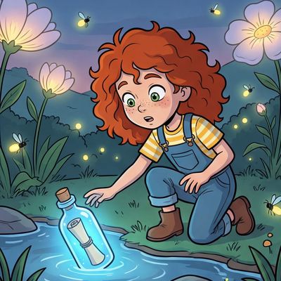
Whimsical Watercolor
Delicate watercolor style with soft edges and translucent color layers.
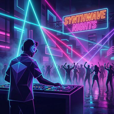
Neon Dreams
Vibrant neon-infused style with synthwave aesthetics.
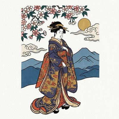
Japanese Woodblock
Style inspired by traditional Japanese ukiyo-e woodblock prints.
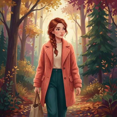
Soft Digital Painting
Contemporary digital painting with smooth gradients and soft lighting.
Bold Vector Pop
Clean, modern vector-style with bold shapes and confident lines.
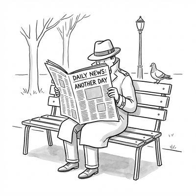
New Yorker Cartoon
Simple black-and-white line drawings inspired by classic editorial cartoons.
Try These Styles Yourself
Create characters, pick a style, and generate consistent illustrations for your book.
Start Free