Ligne Claire
Unique & ExperimentalClean uniform outlines with flat vivid colors, inspired by Hergé and European comics.
About This Style
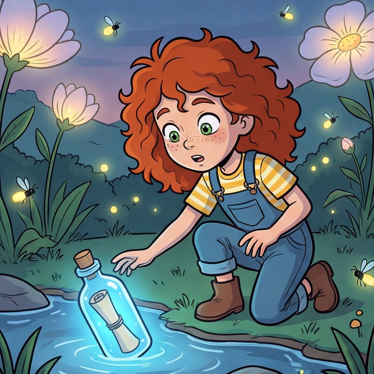
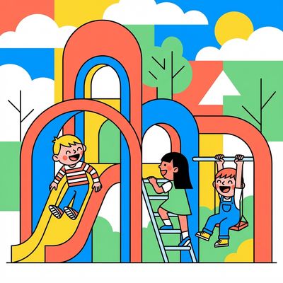
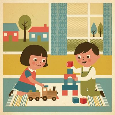
Ligne claire (French for "clear line") is one of the most recognizable illustration styles in comics and graphic storytelling. Pioneered by Hergé in The Adventures of Tintin and refined by artists like Edgar P. Jacobs, Joost Swarte, and Jason, it defined the look of European bande dessinée for nearly a century.
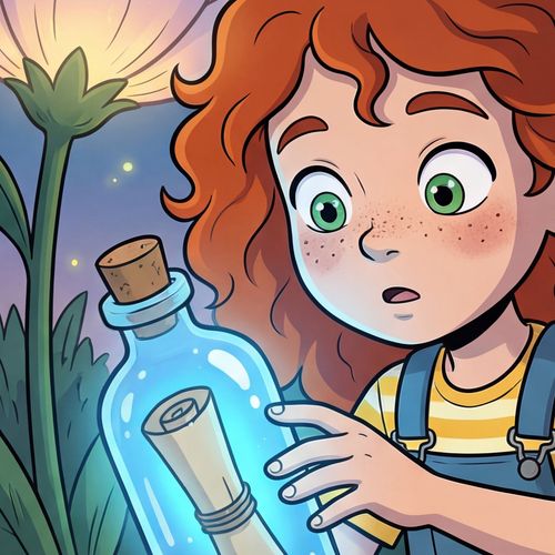
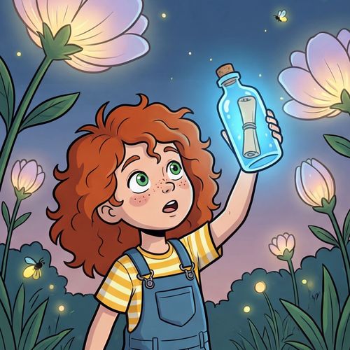
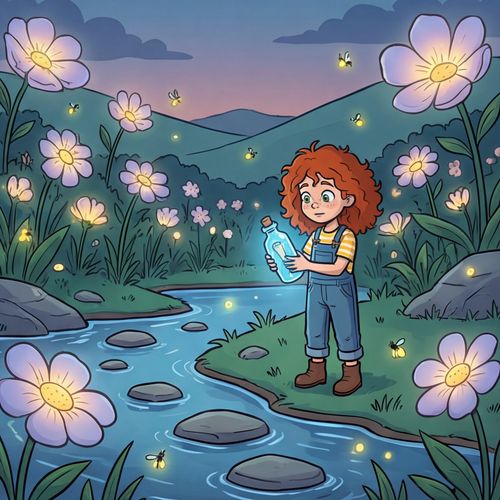
The style is built on clean, uniform-weight outlines and flat areas of vivid color with no gradients or hatching. What makes it distinctive is the contrast between expressive, slightly cartoonish characters and richly detailed, semi-realistic backgrounds — every element outlined with the same consistent line weight.
The flat color palette is bold and balanced, filling cleanly within outlines without blending or soft transitions. This creates illustrations that are visually striking, easy to read, and instantly recognizable. Ligne claire works beautifully for comics, graphic novels, adventure stories, children's books, and any narrative that benefits from a clean, timeless graphic quality.
Color Palette
Strong flat colors with no gradients. Vivid but balanced palette — sky blue (#4A90D9), warm red (#D94F4F), sunny yellow (#F5D547), leaf green (#5DAE5D), warm skin tone (#F2C8A0), and deep navy (#2C3E6B) for outlines and shadows. Colors fill cleanly within outlines with no blending or soft transitions.
Style Details
Base Style
Ligne claire comic illustration style with clean, uniform-weight outlines and no hatching or crosshatching. Flat areas of color with no gradients or soft shading. Expressive, slightly cartoonish characters drawn against richly detailed, semi-realistic backgrounds. Inspired by Hergé (Tintin), Edgar P. Jacobs, and the European clear-line tradition. Every element is outlined with the same consistent line weight, creating a crisp, graphic novel quality.
Characters
Expressive cartoon proportions with slightly oversized heads and large, emotive eyes. Clean outlines define every feature — hair, clothing folds, facial expressions. Simple but highly expressive faces that convey emotion through eyebrows, mouth shapes, and body language. Dynamic poses with clear silhouettes.
Environments
Richly detailed, semi-realistic backgrounds with architectural precision. Buildings, landscapes, and interiors rendered with careful perspective and detail, all outlined with the same clean line weight. Lush vegetation, detailed cityscapes, and atmospheric settings that contrast with the simpler character style.
Avoids
Gradients, soft shading, crosshatching, painterly brushstrokes, photorealistic rendering, blurry or feathered edges, variable line weights, watercolor effects, cel-shading with soft shadows.
Best For
Use Ligne Claire For
Compare With
Learn More
Frequently Asked Questions
What is the ligne claire illustration style?▾
What books and comics use ligne claire?▾
Is ligne claire good for children's books?▾
How does ligne claire differ from manga or American comics?▾
Can ligne claire work for graphic novels and long-form stories?▾
What makes ligne claire different from flat vector illustration?▾
Related Styles
Try Ligne Claire for Your Book
Create your characters, set your locations, and generate consistent Ligne Claire illustrations for your entire story.
Start Free