Bold Vector Pop vs Paper Cutout
Choosing the right illustration style can define your book's mood and message. This comparison between Bold Vector Pop and Paper Cutout will help you decide if you need the sleek energy of modern design or the charming warmth of a tactile, handcrafted aesthetic for your next project.

Key Differences
Overall Aesthetic & Feel
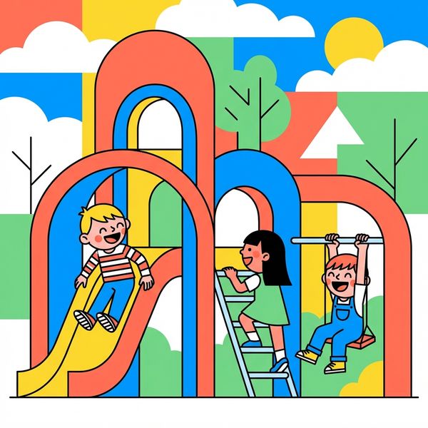
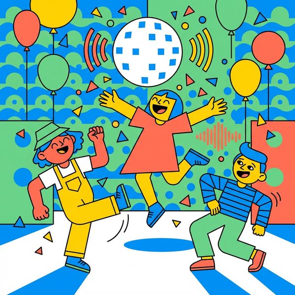
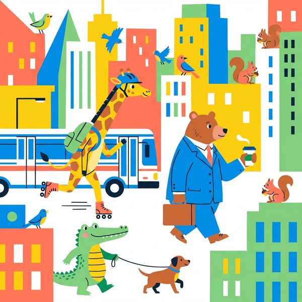
Bold Vector Pop brings a clean, modern, and energetic vibe, characterized by its sharp lines, vibrant colors, and contemporary graphic design influence. It feels digital, confident, and highly stylized.
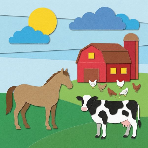
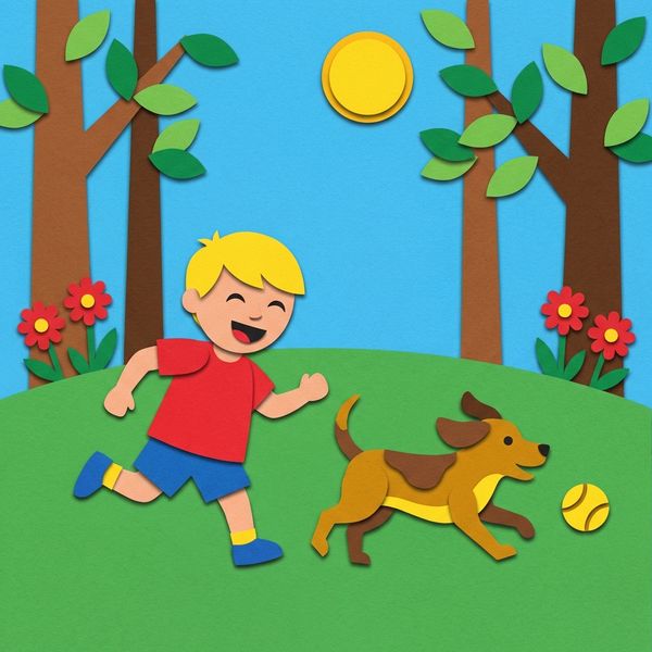
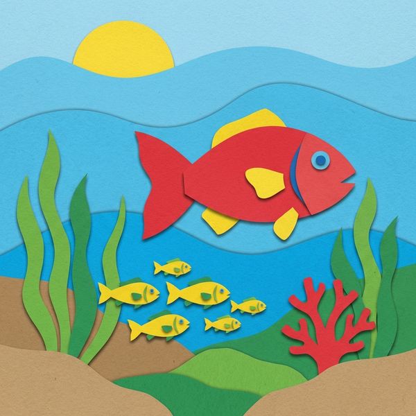
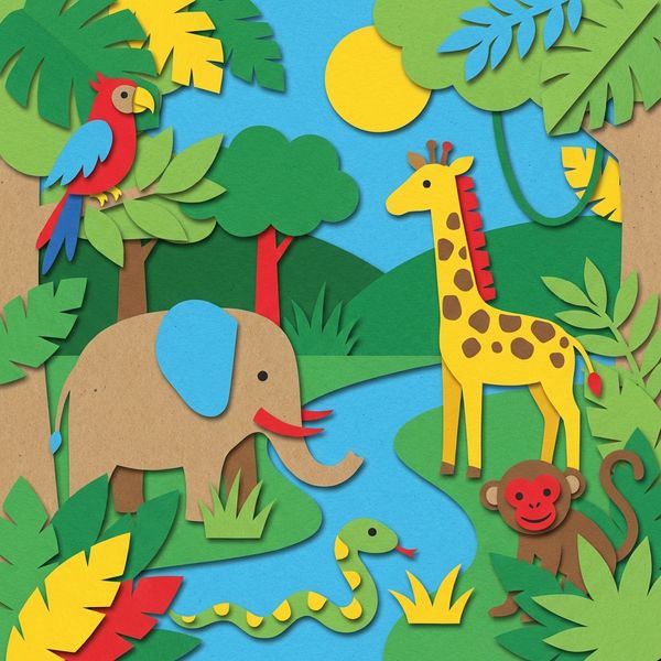
Paper Cutout exudes a warm, tactile, and nostalgic charm, mimicking physical art created with layered paper. It feels whimsical, handcrafted, and inviting, often evoking classic children's stories.
Color Palette
The palette for Bold Vector Pop is vibrant and confident, featuring bright coral, sunny yellow, electric blue, fresh green, and crisp white. These flat colors create a striking, high-contrast look.
Paper Cutout utilizes a palette of bold, construction-paper colors, including primary red, sunshine yellow, sky blue, grass green, and kraft brown. This gives it an earthy, tangible, and approachable feel.
Character Style
Characters in Bold Vector Pop are simplified into geometric shapes with big personalities conveyed through confident poses and clear expressions. They feature smooth, clean edges and a sleek finish.
Paper Cutout characters are simplified into expressive, layered shapes, suggesting form through their layered construction. They often have visible edges and a charming, slightly imperfect quality that mimics hand-cut elements.
Backgrounds & Environments
Backgrounds in Bold Vector Pop are graphic and highly stylized, often using clean patterns and thoughtful negative space to create uncluttered, dynamic compositions.
Environments in Paper Cutout are built from overlapping paper landscapes, with visible layers and edges creating a sense of depth and dimension, as if constructed piece by piece.
Texture & Depth
Bold Vector Pop features flat colors and sharp edges with no visible texture, relying on clever layering of flat shapes and perspective to imply depth in a digitally smooth manner.
Paper Cutout prominently displays subtle shadows, visible edges, and a textured paper quality, creating depth through the physical-mimicking arrangement of overlapping elements.
When to Choose Bold Vector Pop
Choose Bold Vector Pop for projects requiring a modern, energetic, and clean aesthetic, such as educational content, technology-themed stories, or narratives with a dynamic, contemporary feel.
Try Bold Vector PopWhen to Choose Paper Cutout
Opt for Paper Cutout if your story calls for whimsy, nostalgia, or a handcrafted feel, perfect for classic children's tales, nature stories, or heartwarming narratives.
Try Paper CutoutMore Resources
Frequently Asked Questions
How do these styles differ in their overall 'feel' or 'vibe'?▾
Which style would be better for a story that emphasizes whimsy or a handcrafted aesthetic?▾
Can these styles convey complex emotions, or are they limited to simple expressions?▾
Try Both Styles Free
The best way to choose is to see both styles with your own characters and story. Create a free account and try them side by side.
Start Free