Creepy Cute vs Gothic Fairytale
While both 'Creepy Cute' and 'Gothic Fairytale' embrace darker aesthetics, they diverge significantly in their approach to charm, detail, and overall mood. Understanding their unique characteristics is crucial for selecting the perfect illustration style for your book, whether you seek whimsical darkness or romanticized grandeur.
Key Differences
Overall Aesthetic & Inspiration
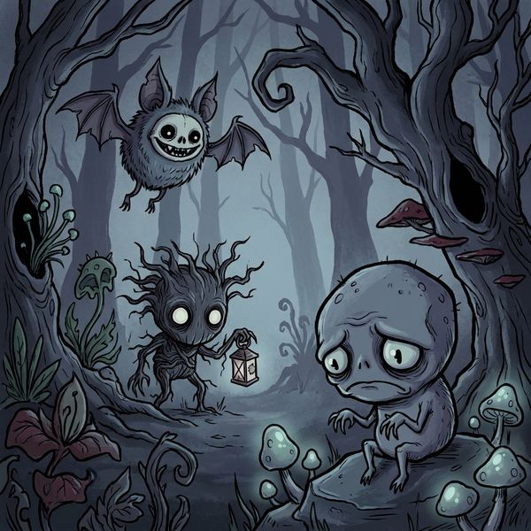
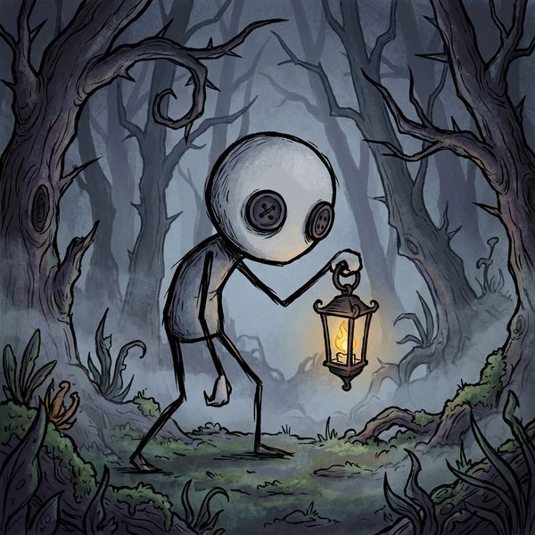
Creepy Cute masterfully blends unsettling elements with an endearing charm, inspired by the distinctive character designs of Don't Starve, the subtle horrors of Junji Ito, and the whimsical darkness found in Adventure Time.
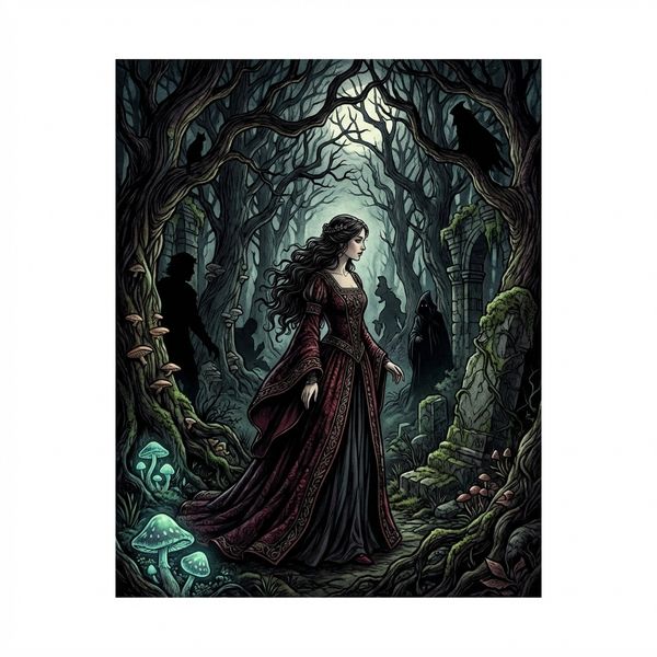
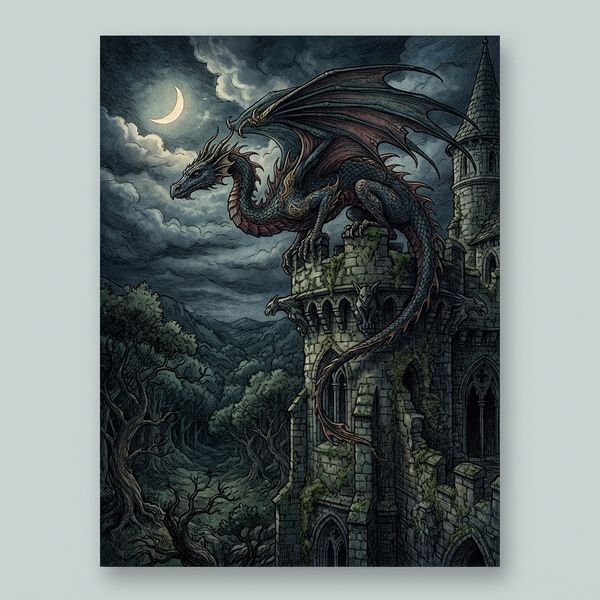
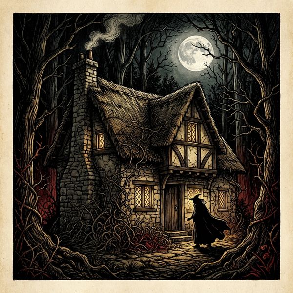
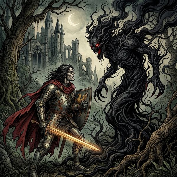
Gothic Fairytale channels the profound dark romanticism inherent in classic fairy tale illustrations, drawing heavily from the masterworks of Arthur Rackham, Edmund Dulac, and the fantastical visions of Brian Froud.
Linework & Texture
This style features thick, distinctly defined outlines that often possess a slightly rough, almost hand-drawn texture, contributing to its quirky and organic feel.
Characterized by rich, intricate linework and dramatic lighting, the Gothic Fairytale style emphasizes depth and intricate details, often with a more refined and illustrative finish.
Color Palette & Mood
A muted palette dominates, primarily utilizing blues, grays, and purples to establish a dark yet readable mood. Deep greens and reds are used sparingly as impactful accents.
A deep, high-contrast palette defines this style, featuring midnight blacks, blood reds, antique golds, and forest shadows, all enhanced by dramatic shadows and jewel-tone accents for a rich, opulent feel.
Character Design & Proportions
Characters are highly stylized with slightly unsettling proportions: large heads, noticeably thin limbs, and big eyes often containing small pupils, contributing to their unique, 'cute but eerie' appeal.
Characters are elegant and often feature slightly elongated proportions, complemented by flowing hair and elaborate, period-inspired costumes that enhance their refined and dramatic appearance.
Environmental Detail
While backgrounds exist, the focus is primarily on the unique character designs. Environments tend to be less intricate, serving to highlight the figures within the scene.
Environments are dense and richly detailed, often forming intricate backdrops that contribute significantly to the narrative and immersive quality of the illustration.
When to Choose Creepy Cute
Choose 'Creepy Cute' for projects seeking a unique blend of endearing charm and unsettling whimsy, perfect for indie games, dark fantasy children's books, or stories with quirky, character-driven narratives that embrace a playful macabre.
Try Creepy CuteWhen to Choose Gothic Fairytale
Opt for 'Gothic Fairytale' when your project demands a sense of elegant drama, dark romanticism, and richly detailed, immersive worlds. It's ideal for adult fantasy novels, re-imagined classic tales, or narratives requiring a sophisticated, mysterious, and grand aesthetic.
Try Gothic FairytaleMore Resources
Frequently Asked Questions
Which style offers more intricate background and environmental details?▾
If I want a 'cute' aesthetic with a dark twist, which style is more appropriate?▾
Which style is better for conveying a sense of classic fantasy grandeur?▾
Try Both Styles Free
The best way to choose is to see both styles with your own characters and story. Create a free account and try them side by side.
Start Free