Bold Vector Pop vs Ligne Claire
When illustrating for children's books or digital content, choosing the right style sets the tone. Both Bold Vector Pop and Ligne Claire offer distinct aesthetics that prioritize clean lines and flat colors, yet they evoke very different moods and suit varied narrative approaches. This comparison will help you decide which style best brings your vision to life.


Key Differences
Color Palette
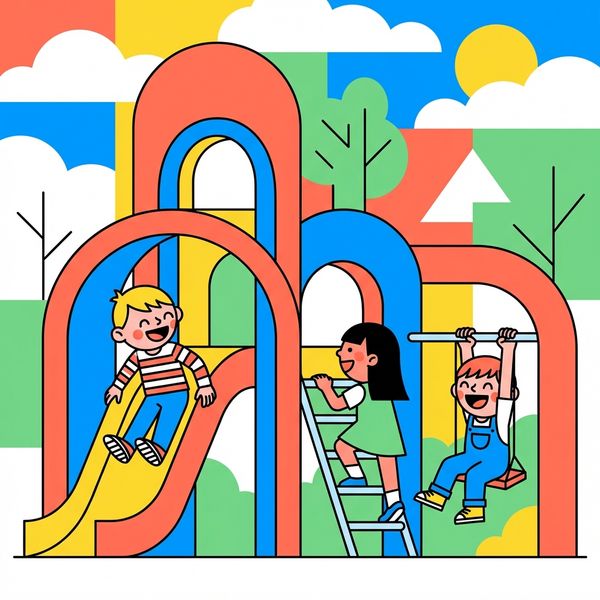
Features a vibrant and confident palette, including bright coral, sunny yellow, electric blue, and fresh green, often contrasted with crisp white. Colors are flat and bold, without gradients.
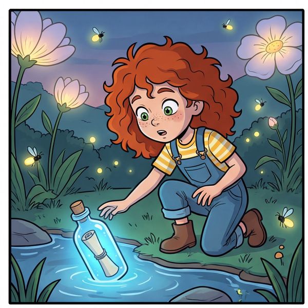
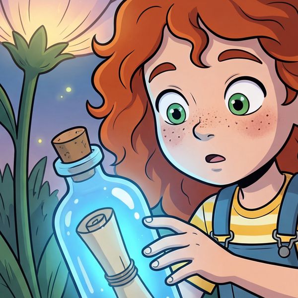
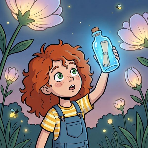
Utilizes vivid flat areas of color with no gradients or hatching. The palette is often rich and precise, contributing to the clarity and timeless feel of the illustration.
Line Work
Defined by confident, clean lines that outline bold, often geometric shapes. The line weight is consistent but can vary to emphasize certain elements.
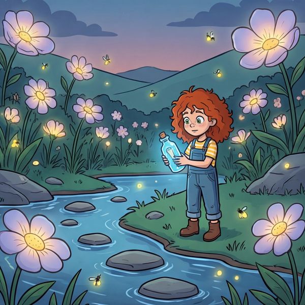
Characterized by extremely clean, uniform-weight outlines that define every element, from characters to intricate background details. This consistent line creates a distinctive clarity.
Character Style
Characters are simplified into geometric shapes, conveying big personalities through exaggerated poses and expressive, minimalist facial features. They are modern and stylized.
Characters are expressive and slightly cartoonish, often designed to stand out against more detailed backgrounds. Their expressions and gestures are clear and readable, maintaining the iconic clear-line tradition.
Backgrounds & Detail
Backgrounds are graphic and highly stylized, making extensive use of patterns, bold shapes, and negative space rather than realistic detail. They are minimalist and serve to frame the characters.
Backgrounds are richly detailed and often semi-realistic, meticulously outlined with the same uniform line weight as the characters. Every element, from architecture to foliage, contributes to a sense of place and depth.
Overall Aesthetic & Influence
Draws heavily from contemporary graphic design and modern children's book aesthetics, creating a fresh, dynamic, and distinctly current look.
Rooted in the iconic European clear-line comic tradition, pioneered by Hergé (Tintin). It conveys a sophisticated, timeless, and slightly nostalgic feel, emphasizing clarity and precision.
When to Choose Bold Vector Pop
Choose Bold Vector Pop for projects that demand a fresh, energetic, and contemporary feel, such as modern educational content, apps, or stories with a playful and dynamic spirit. It's excellent for conveying bold ideas with immediate visual impact.
Try Bold Vector PopWhen to Choose Ligne Claire
Ligne Claire is ideal for narrative-driven projects that benefit from a timeless, sophisticated, and adventurous aesthetic, especially those requiring rich world-building and a strong sense of place. It's perfect for classic tales or stories with intricate details.
Try Ligne ClaireMore Resources
Frequently Asked Questions
Which style offers more detailed backgrounds?▾
Do either of these styles use gradients or shading?▾
What's the key difference in character design between the two styles?▾
Which style provides a more 'modern' feel?▾
Try Both Styles Free
The best way to choose is to see both styles with your own characters and story. Create a free account and try them side by side.
Start Free